This set of design principles is concerned making information spaces effectively navigable. Navigability means that the navigator can successfully move in the information space from his present location to a destination, even if the location of the destination is imprecisely known. Three criteria determine the navigability of a space: first, whether the navigator can discover or infer his present location; second, whether a route to the destination can be found; and third, how well the navigator can accumulate wayfinding experience in the space.
The first criterion, successful recovery of location and orientation, asks the navigator if he can definitively answer the questions, ``Where am I?'' and ``Which way am I facing?'' A response to these questions could be verbal, such as ``I am in Lobby 7, facing Massachusetts Avenue3,'' or written, by drawing an arrow on a map of the environs.
The second criterion for navigability is the ability to successfully perform wayfinding tasks. Successful wayfinding occurs when the navigator can make correct navigation decisions that take him from his present location to a destination that fulfills his larger purpose. Examples of such decisions are whether to continue along the present route or to backtrack, what turn to take at an intersection of paths, or whether to stop and aquire information from the environment to confirm the present route. Arthur and Passini call wayfinding spatial problem solving [Arthur and Passini, 1992], in which the navigator finds a satisfactory solution to a larger task through navigation.
The third criterion for navigability is how well the navigator can accumulate wayfinding experience in the space. The imageability of a large-scale space is the ability of a navigator to form a coherent mental image or map of it. Kevin Lynch, an urban planner, first investigated how the characteristics of an urban space affected how well people remembered features in it [Lynch, 1960]. Lynch interviewed residents of Boston, Los Angeles, and Jersey City, New Jersey, and asked them to draw sketch maps of their city from memory. From these sketch maps and verbal interviews Lynch compared the imageability of the the cities: how well the sketch maps and interviews reflected the actual layout of each city. Lynch found that the respondents organized their city images using a set of common features: paths, landmarks, regions, edges (barriers), and nodes (intersections).
What makes Lynch's findings especially interesting is that the imageable or memorable features of a space are used by people to assist wayfinding. Landmarks are memorable locations that help to orient the navigator; regions are distinct areas that place him in one part of the environment; and nodes mark points where wayfinding decisions are made. Since a navigator's uses these features to record his past route-following experiences, a designed space that employs them should be more effectively navigable.
These last two criteria, wayfinding ability and imageability, have special relevance for information spaces. Wayfinding in an information space, we have argued, should correspond with information-seeking behavior in an information access environment. Successful wayfinding then implies that the user can use the information access environment to fulfill his information need. In a navigable information space, the problem of being ``lost in hyperspace'' [Edwards and Hardman, 1993] could then be solved.
In an imageable space, each episode of successful navigation can contribute in building a coherent mental picture of the information environment and of the content therein. Ideally, the user becomes more and more effective in fulfilling information needs every time he navigates through the environment. And in an information space organized on a principle relevant to the user's task, the mental map corresponds to a conceptual map of the content, reflecting important relationships in the information and the principles used to organize it.
The principles here come from both the study of museum exhibits and the research of environmental psychologists, cognitive scientists, and others who study how humans represent and navigate in the physical environment.
Principles for effective wayfinding include:
The principle. Give every location in a navigable space a unique perceptual identity, so that the navigator can associate his immediate surroundings with a location in the larger-scale space. It speaks most directly to the first criterion for navigability, the ability to recover position and orientation. This principle indicates that every place should function, to some extent, as a landmark - a recognizable point of reference in the larger space.
Source. The idea of places needing an identity for wayfinding is discussed in Arthur and Passini [Arthur and Passini, 1992]. They introduce the notions of identity and equivalence for speaking of the perceptions of places. Identity is what makes one part of a space distinguishable from another, and equivalence is what allows spaces to be grouped by their common attributes. They argue that identifiable places form the building blocks of our cognitive maps and the spatial anchors for the decisions made during wayfinding.
Applicability and design consequences. Ideally, a space should have just enough differentiability for this principle to hold, but no more. Neon lights should not be necessary. And, if the information space is built around an organizational principle, differentiability may be reflected by that organization naturally. For example, suppose the navigator is traversing a spatial timeline. Then each location corresponds to a point in time, giving a ready-made identity to it.
An example. Perhaps the best way to illustrate this principle is to see what happens when it fails. Those familiar with the original text-adventure game ADVENT will know that the adventurer will eventually find his way into a part of the cave which the game describes as:
You are in a maze of twisty little passages, all alike.
No matter which direction the player moves, the system will again respond
You are in a maze of twisty little passages, all alike.
(unless the player is fortunate enough to emerge from the maze strictly by chance.) What to do?
An effective strategy is for the player to drop one of the items he is carrying in the room, then make a move and see what happens. When the player re-encounters a room with an item, the system responds
You are in a maze of twisty little passages, all alike.
There is a bag of coins here.
Now the room has an identity. The player can repeat this process to map out the entire maze as a directed graph, and emerge on the other side.
Source. Lynch [Lynch, 1960] dicusses landmarks in an urban context at length, and describes their defining physical characteristic as ``singularity, some aspect that is unique or memorable in context.''
Landmarks were also evident in an exhibit setting. Landmarks such as the large water pump model in Leonardo (catalog number 112) and the octagonal case holding Jacqueline Kennedy's dinner gown (catalog number O26) were both physically large and visually distinct from their context, meeting Lynch's requirements as landmarks. Landmarks can be distinguished spaces as well as memorable objects; for example, the Oval Office exhibit marked the midpoint of the Kennedy museum.
Applicability and design consequences. A system of landmarks helps to organize and define an information space. However, they should be used sparingly; placing too many landmarks in the space belies their usefulness as memorable and unique locations. Landmarks, then, are a scarce resource that can be used not only to assist wayfinding but also to serve the space's larger purpose. Since a landmark defines a surrounding region to which it is adjacent, it could stand as a exemplar or representative for that region's content. Landmarks can also head paths emanating from junctions, and indicate what's down the road. Landmarks are the anchors along which paths are defined and our mental maps are built; they should reflect the top level of the organizing principle of the space.
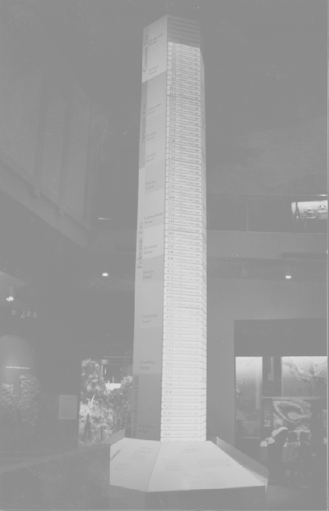
An example. An interesting use of a landmark is found in the National Museum of Natural History's fossils exhibit. Near the entrance, a tall (approximately 20 meters high) ``time tower'' is visible from most of the central area of the exhibit (Figure 5-1). In a multi-level exhibit with a complex circulation pattern, it is a valuable physical landmark and point of reference with wide visibility. It also displays the time periods represented by the fossils in the exhibit and the corresponding terms associated with them. So, it serves as both a wayfinding aid and a way of communicating information important to understanding the exhibit.
The principle. Paths should possess a set of characteristics to be ``well-structured.'' Well-structured paths are continuous and have a clear beginning, middle, and end when viewed in each direction. They should confirm progress and distance to their destination along their length. And a navigator should easily infer which direction he is moving along the path by its directionality or ``sidedness.'' These concepts are summarized in Figure 5-2. A well-structured path maintains a navigator's orientation with respect to both the next landmark along the path and the distance to the eventual destination.
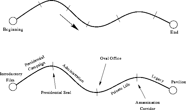 |
Source. The exhibits studied can each be thought of as a well-structured path. For those that were spatial timelines, the start of the timeline, its extent, and its end create the path. For those that communicated messages, movement from one message to the next marked progress. Exhibits with memorable introductions and conclusions have well-defined beginning and end-points for their paths.
Applicability and design consequences. This principle informs how the traversal of a pre-defined route will appear to the navigator. The features of a well-structured path should again correspond to concepts relevant to the content of the space. The beginning and end of the path form an introduction and conclusion, and progress is marked by moving from one concept or message to the next. A continuous path should have both shared attributes that define it as distinct from its context, and evolving or changing features that mark its length and connect one part to a subsequent part.
An example. The Kennedy museum, as a spatial timeline, was a well-structured path (again, refer to Figure 5-2). The beginning of the path is the 18-minute introductory film; progress is marked by proceeding through his campaign, administration, family life, assassination, and legacy; and the pavilion provides an end-point. Directional ambiguity is resolved by whether motion is forward or backward in time through the events in Kennedy's life.
Another example outside of the domain of exhibits are interstate highways. The entrances and exits along the highway are clearly marked by signs, and mile markers indicate progress and relative distance to destinations. In this case, the path is structured not so much by diversity of appearance or meaning, but by a system of signs arranged along its length.
The principle. Subdivide the space into regions with a distinct set of visual attributes to assist in wayfinding. The character that sets a region apart can be some aspect of its visual appearance, a distinction in function or use, or some attribute of its content that is consistently maintained within the region but not without. Regions may not have sharply defined boundaries, or their extent may be in some part subjective; but a minimal requirement is that there is a generally agreed space said to be within the region, and a surrounding area said to be outside it.
Regions assist wayfinding by providing another set of cues for recovering location. They associate a set of defining features with an area in space, and give a way of identifying a place as being in a certain region. When the navigator moves from one region to another, the shift in the character of the space is another fact that informs him of his location along the boundary of the two regions.
Source. Regions are used in exhibits in two ways. The first is as another aspect of the environmental look principle, from a wayfinding perspective. The consistent environmental elements that make for the visual identity of the exhibit as a whole define it as a region, apart from the rest of the museum. In addition, the distinct appearance of individual parts of the exhibit define sub-regions within that larger region.
The second is the use of enclosures to create regions in an exhibit. Moving from one room or gallery to another through a threshold makes explicit the motion from one region of the exhibit to another.
Applicability and design consequences. Regions allow the navigator to distinguish one part of the space from another and to know when he has moved across the boundary between two regions. These boundaries can serve as demarcations along a well-structured path through several regions. For communication, a region can correspond to some attribute shared by the content within, such as supporting the same message, teaching the same concept, or relating the same event.
An example. In Leonardo, Ed Rodley [Rodley, 1997] cited how visual elements marked the boundaries of the main areas of the exhibit; variations in color treatments of walls and moldings, archways of differing shapes, and differing light levels all reinforced the transitions through archways from one region to another. And, referring back to the message hierarchy for Leonardo, we see that each message corresponds to a particular, enclosed region of the exhibit (Figure 4-1).
The principle. If there is a story to tell, design the space so that it is coherent for every route the navigator might take.
Source. This principle was explicitly used to inform the design of the Leonardo exhibit. In particular, the visitor was given a choice at the ``Florence in 1470'' room to proceed straight ahead into the ``Art Gallery'' to or to veer right into the ``Art Studio'' rooms. According to Ed Rodley [Rodley, 1997], the exhibit was designed to repeat the messages conveyed in the Art Studio in a display in the Art Gallery, so that even if a visitor missed the ``Art Studio'' they would be exposed to these messages. This principle was applied throughout the exhibit, with the layout designed to ensure that people encountered the main points no matter what route they took.
Applicability and design consequences. This principle is best used when there is a story you want every navigator to see. This basic story should be communicated by every path the navigator can take through the space. Opportunities for detours, side-tours, and exploration can branch off of this main path, eventually returning to resume the main story.
This principle, and the underlying assumption of a narrative for the space, indicate that the organization should have a primary path for visitors to follow (for example, as in Figure 4-3). The underlying question that this principle tries to address is, how many choices should be made for the navigator? An answer is, enough for the navigator to learn what the communicators intend.
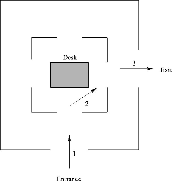
An example. We can also look at what happens when this principle is not applied. The original Kennedy museum had a plan in which the visitor entered a central area with his desk and had to then choose where to explore from this area (see Figure 5-3). By making a right turn, the visitor could skip the majority of the central area of the exhibit, possibly without being aware of it, and proceed to exit onto the pavilion. Frank Rigg noted this problem in an interview [Rigg, 1998].
 |
The principle. When navigating in any type of space, a map is a valuable navigation aid. It places the entire space within the navigator's view, and several kinds of judgements can be made readily:
In addition, the survey view provides a ready image of the space, which can provide the basis for the navigator's mental map. Several researchers have found that giving subjects access to only survey knowledge of an environment can give comparable or superior performance to knowledge gained from route-following experience on landmark estimation and sketch-mapping tasks [Thorndyke and Hayes-Roth, 1982] [Golledge et al., 1995]. The navigator's mental map, primed with the image of his environment, can be augmented readily with experience gained from actual navigation in the space.
For an information space, a survey view has another role. It not only assists navigation in the space, but because the space corresponds to a conceptual organization of the information it contains, it serves as a succinct expression of meaningful relationships in that information. In more concrete terms, it assocaties the location of every document, image, or object with a message, a point on a timeline, or a concept to be learned. A map of the physical (or virtual) space can thus serve as an external representation of the conceptual map of the content. This conceptual map uses the navigator's ability to form mental representations of a physical space to store knowledge about conceptual relationships in the information space.
Source. Nearly every exhibit studied had a plan map either on a brochure distributed to visitors as they went in or mounted as wall plaques inside the exhibit itself.
Applicability and design consequences. Although it would seem to always be beneficial to provide a map, there may be sufficient wayfinding aids (such as signs and landmarks) already embedded in the space already to make a map unnecessary. Small spaces with which the navigator is already familiar may not need a map. A map can serve as reference material: available when needed, and able to be tucked away when not.
Maps are more useful when views in the space are insufficient to give information about unfamiliar regions, which is true in enclosed spaces with limited views in each direction.
An example. Leonardo had two maps situated at the entrances to the two latter sections of the exhibit (catalog numbers 74 and 148), identical to the map on visitor brochures (Figure 3-1). The Holocaust exhibit had wall-mounted maps at the beginning of each floor, labeled with each major section of that floor. Maps of the entire Holocaust Memorial Museum were also provided in visitor brochures (Figure 3-13).
The principle. Place signs, when necessary, at decision points. Decision points are where the navigator must make a wayfinding decision (for example, whether to continue along the current route or to change direction.) A sign embeds additional information into the space to direct the navigator's next navigational choice. This information should be relevant to both the choices offered to the navigator at that point, and the larger goal of the navigational task. Simply put, a sign should tell the navigator what's in the direction it points, and the destinations so indicated should help the navigator reach his eventual goal.
Source. Passini describes this principle as part of his theory for wayfinding as spatial decision-making [Arthur and Passini, 1992] [Passini, 1984]. According to this theory, a navigator begins with a high-level goal, and acquires information from his environment (or uses what he already knows about the space) to make his first move towards a top-level destination. At decision points along the route, the navigator combines observation of local features with previous knowledge of the space to make the proper navigational move.
When the navigator does not have previous knowledge of the space, or a map to refer to, only the local features at the decision point can inform his navigational choice. A sign placed at a decision point in this framework, needs to inform the navigator of the correct route.
Applicability and design consequences. When placing signs, we can ask two questions at the decision points in the space:
By design, signs must be in a location to acquire the navigator's attention, yet space for signage is a scarce resource. The benefits of signage must be weighed against the other potential uses for the space it occupies.
An example. One example of effective signage in action is at an airport. The environment may be completely unfamiliar to first-time visitors, and signs are the main means of directing them to their destination. Departing travelers have a typical routine of leaving from ground transportation or parking, checking in with their baggage, passing through security, and going to the departure gate. Arriving passengers must claim their baggage and proceed to ground transportation or parking. Effective signs in an airport both direct visitors at decision points to useful destinations and confirm their route along the way.
The principle. Give the navigator a more extensive view in a particular direction and a goal to draw him in that direction. In an exhibit space, in which the first-time visitor has uncertain expectations as to its extent and purpose, sight lines are valuable means of giving enough information about what's ahead to encourage the visitor to move farther. Sight lines give long but narrow samples of unfamiliar space. Based on that sample, the viewer can determine if that direction is of interest or not.
To make a sight line interesting, the designer can provide a ``wienie'' - a goal to navigate toward. It might be some feature or object that is striking or unusual, something to spark the navigator's interest. It is the reward for choosing the path that it lies at the end of.
Source. This principle comes from Martin Sklar, president of Disney Imagineering, relating ``Mickey's Ten Commandments'' for museum exhibitions at the 1987 American Association of Museums Annual Meeting [McLean, 1993]: ``Create a `wienie' [ sic]... That's what Walt Disney called it...You lead visitors from one area...or one exhibit to the next by creating visual magnets. Reward people for walking from point A to point B.''
Applicability and design consequences. Providing selective views into a larger space is a way of letting the viewer take a representative sample of what's available and letting him make wayfinding decisions on that basis. It could be thought of as an alternative to a sign; instead of telling him that the destination is down this path, you can show him where it is (although it might be far away). The information available at a decision point should also depend on what sight lines are offered by each of the choices. Sight lines and wienies are tools the designer has to lead the visitor from one part of the space to the next.
An example. Sight lines were important in the Kennedy museum. At the end of the main corridor, an octagonal case with Jacqueline Kennedy's dinner gown was visible from the beginning, and served to draw people forward through the corridor. The case was situated in a temporary exhibit space that formerly housed an exhibit on the Nuclear Test Ban Treaty, which apparently was less interesting; once the case was installed, it actually improved visitor traffic into the adjacent exhibit on Robert F. Kennedy [Rigg and Wagner, 1997].
Another example is from the original Kennedy museum, before redevelopment. In exhibit 17, a film clip of a press conference was activated by a floor sensor: the monitor in the exhibit was blank until the visitor stepped in. Visitors would glance into the exhibit, see a blank screen, and move on. Once the clip was made into a continuous loop, traffic flow improved into the exhibit.
These principles can be roughly divided into two classes. The first class of principles, one through four, develop a basic vocabulary of spatial features that assist wayfinding and imageability: identifiable places, landmarks, paths, and regions. In an information space, these features should be used to communicate the conceptual organization of its content. It is this correspondence that makes meaningful navigation possible in the space.
Principles in the second class, six through eight, are about the views that the navigator has into the space, and how designers can provide the information necessary for wayfinding and decision-making. Survey views are maximal; they give the navigator the most information about the space at once. Sight lines are local views deep into the space in an interesting direction. And signs are the authorities in information spaces, providing locally relevant wayfinding cues.
The remaining principle, the fifth, ties the structure of the space to the task of interest - communication of some body of knowledge - by ensuring that the route the navigator takes will expose him to the ideas the communicator wishes to express.